John Hartman, illustrious illustrator
Our talented illustrators make the projects featured in FWW easier to understand. Here, we show off some favorite illustrations John Hartman has done for us over the years.

I was first introduced to Fine Woodworking magazine when my mother-in-law bought me a subscription as a gift. The first thing that struck me was the real, hand-drawn artwork. I was immediately interested in the articles and the layout design drew me in, but the artwork was what I appreciated most.
Years later, now working in the art department myself, one of my favorite parts of the job is placing final art in a layout. When I start to work on a layout I read and re-read the text to get my head in the project. Then, when adding photos, the story starts to become clear on another level. Something in the subject usually inspires a design idea and I’ll start to move things around. Then I’ll move things back, then move things around some more. Incorporating illustrations adds the final level of detail and clarification, because sometimes a photo just isn’t at the ideal angle, or you might wish you could see something right up close or even better, see through it.
The process of adding illustrations goes a little like this: When the layout is close to being complete, I’ll sketch rough art in a certain perspective and place it where I think it works best in the article, then send it off to an illustrator. We collaborate on what I was imagining for the drawings and then many times, they’ll have suggestions of how to make it even better. This is the case with illustrators like John Hartman.
When I get the final illustrations back, placing them in the layout is the last (and my favorite) step. After 13 years and quite a few completed layouts, it never gets old.
Here are some of my top picks of drawings John has done from past issues and even the current one.
“Shaker Chimney Cupboard” by Michael Pekovich, issue #232
The color in this illustration is great and I love the cutaway treatment to show various details from different angles.
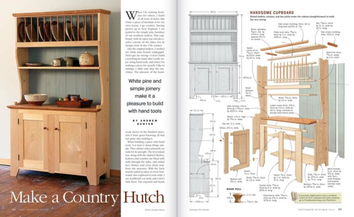
“Make a Country Hutch” by Andrew Hunter, issue #242
This illustration packs a whole lot of information in a relatively small space. It’s a good size project yet everything you need to know to build it can be gleaned from that one page.
“Bedside Table” by Garrett Hack, issue #253

A beauty of a table illustrated in a two-page spread with an exploded drawing and detailed drawings of classic joinery. I’m not sure what else to say.
“Stand Up to This Desk” by Christian Becksvoort, issue #257
This project is basically two projects in one. It’s a lot to show in one illustration even if it sits on two pages. The base is covered mostly on one page but the drawer is still shown by jumping across the next page. The blued out top hints that there’s more to come.
The next two pages show the blued-out base for orientation and then moves on up to the top.
“Strong, Stunning Sideboard” by Chris Gochnour, issue #277
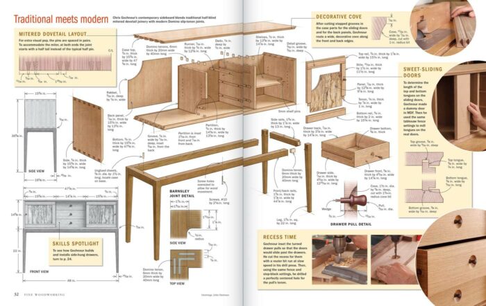
With a half-blind mitered dovetail case and gunstock legs, this project has a lot to love. How often do you get to see a drawing of live oak veneers sliced from a spalted firewood log?
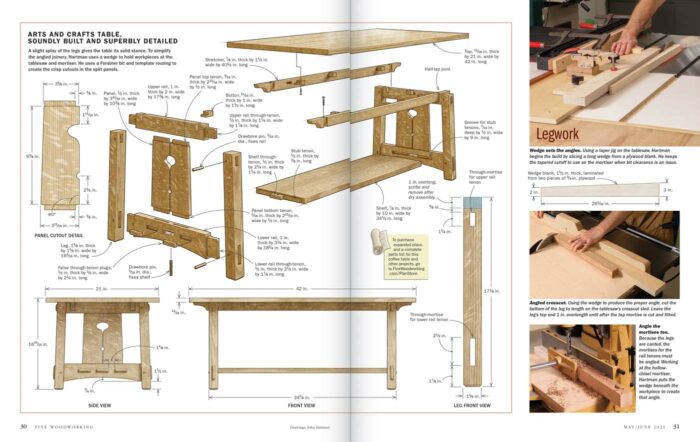
Arts and Crafts Coffee Table” by John Hartman, issue #289
I love the look of actual quartersawn oak in person, but I think I like drawings of quartersawn oak even better. I’m still not sure how John does it. I have to say on this layout, it was pretty fun to ask the author to illustrate.
-John Tetreault















Comments
Very nice post! This is one of those things that gets done so well, you take it for granted. I have always enjoyed the exploded views but never explicitly realized the detail and skill that went into it. It's that level of talent, attention to detail, and professionalism that engages me with the pages of FWW. Thank you, John H., for such a job well done. Thank you, John T., for bringing attention to what should have been obvious to me in the first place.
Log in or create an account to post a comment.
Sign up Log in